Tanlines: Highlights
After we did the layout for the packaging of their second album, Highlights, the pop duo Tanlines approached us to help conceive and design an unusual rollout for the record — one that would get attention, and set it apart in the sea of summer releases.
-
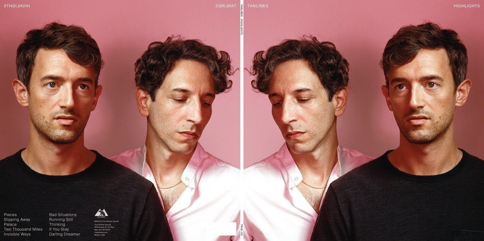
Highlights LP cover: front and back.
-

CD face with tan yin yang, the official icon of Highlights. The official icon of their previous album was the winky sad, which we can take no credit for. ;(
-
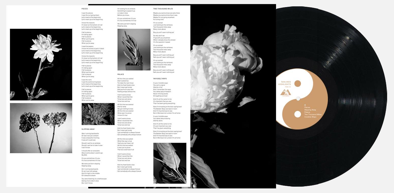
LP insert, sleeve, and record face.
Sporting a striking cover shot of bandmates Eric and Jesse taken by Autumn DeWilde, black-and-white flower photography by Jenny Hueston, and minimal typography, the album’s packaging was meant to have a low-key, classic feel. But we wanted each promotional item we designed to be entertaining on its own, and to poke a little fun at the rigmarole that is an album rollout.
-
-

Tanlines Netflix logo
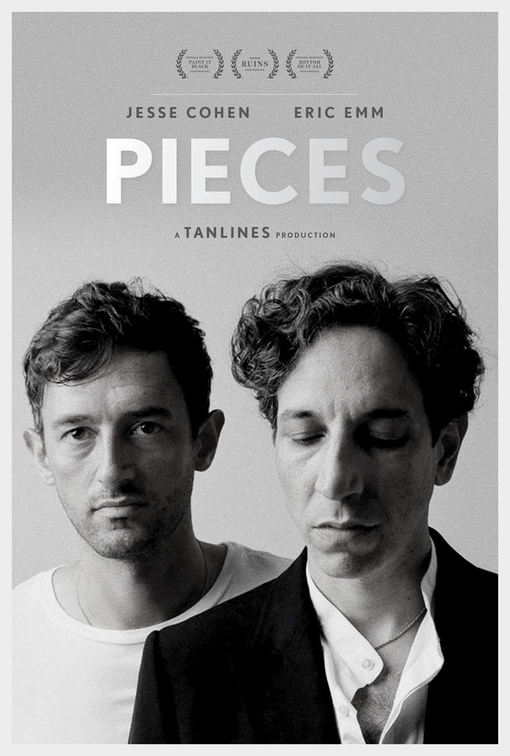
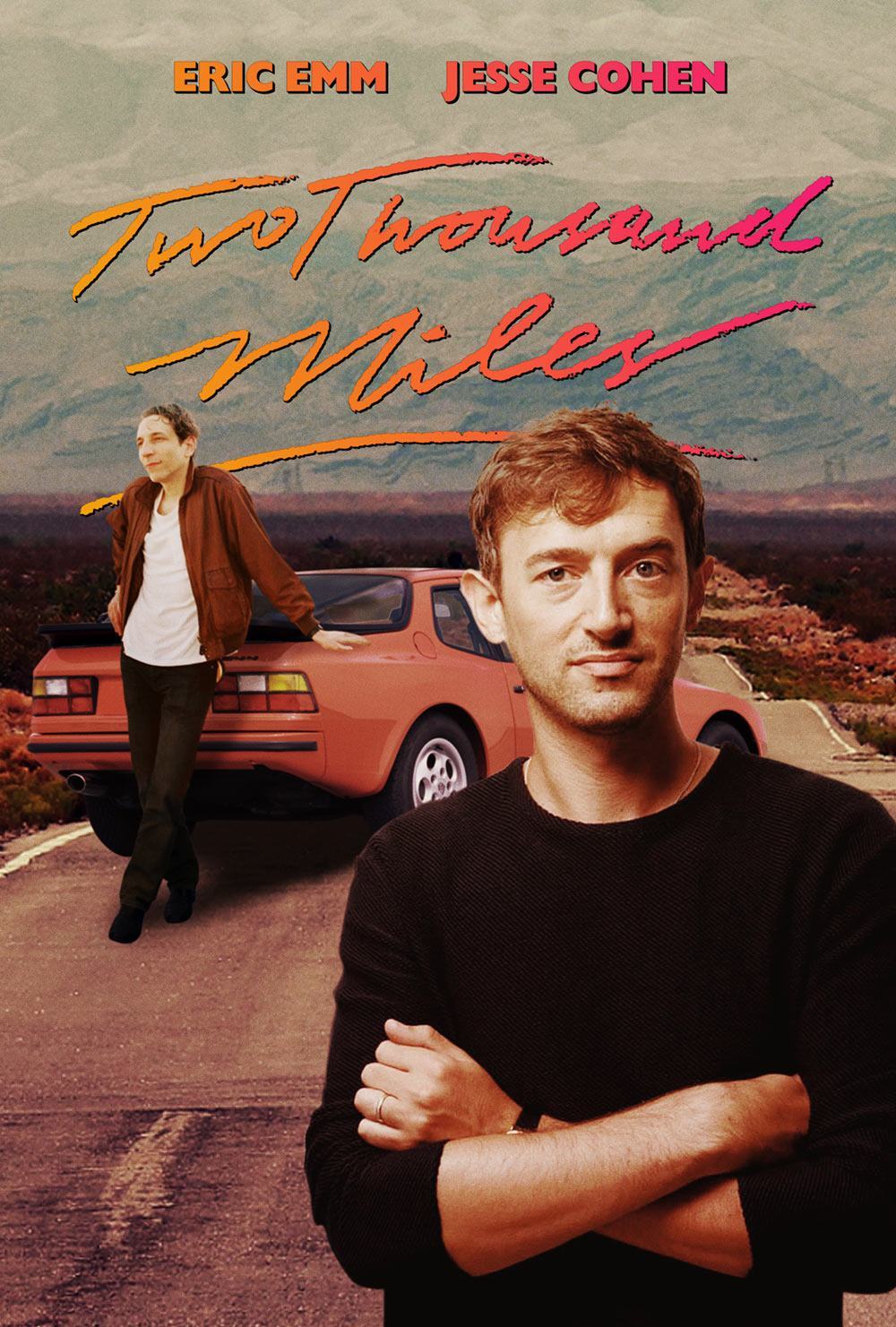
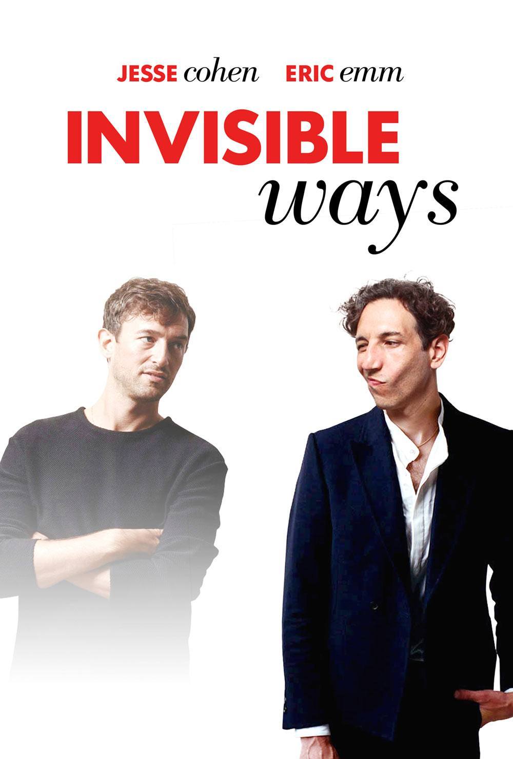
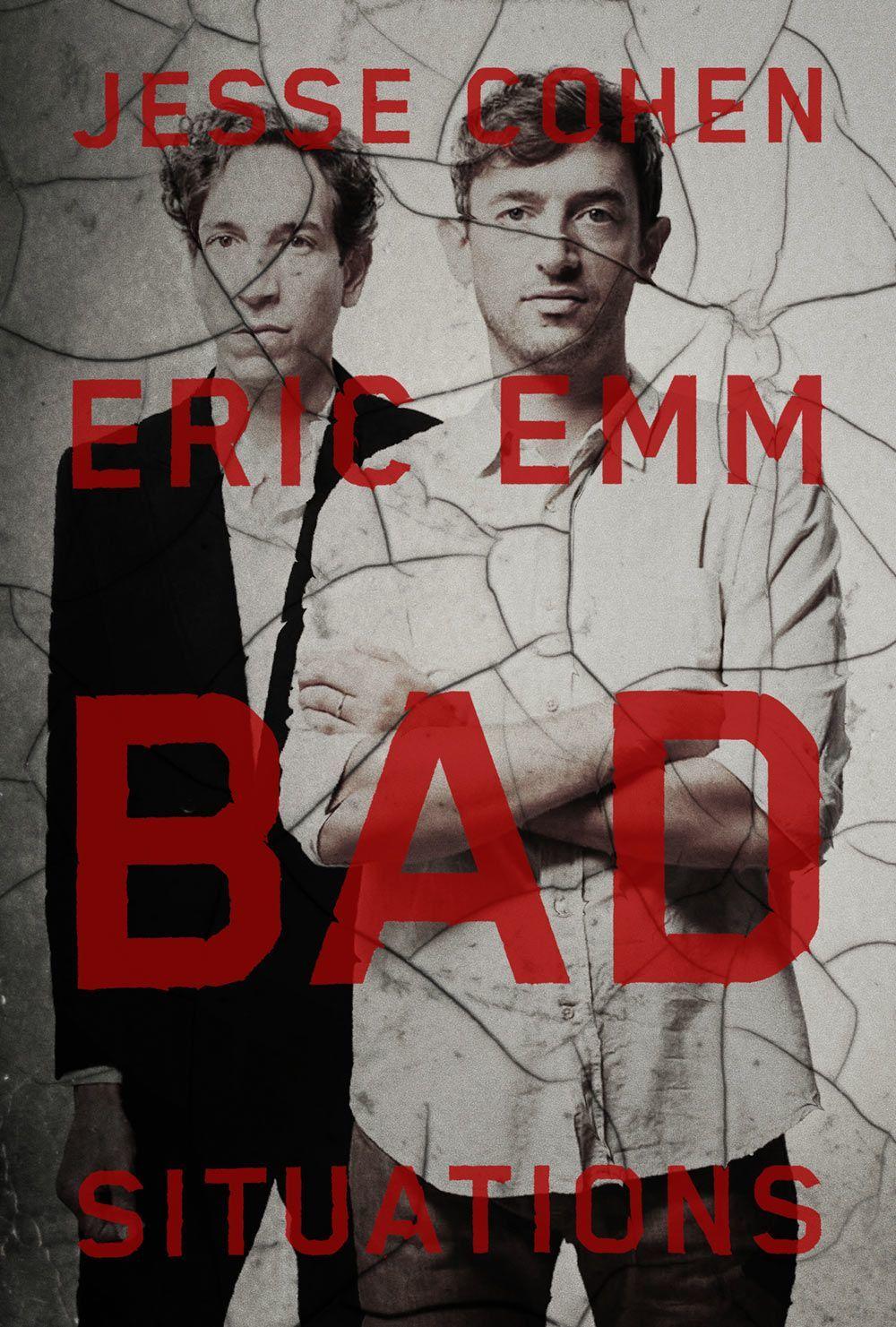
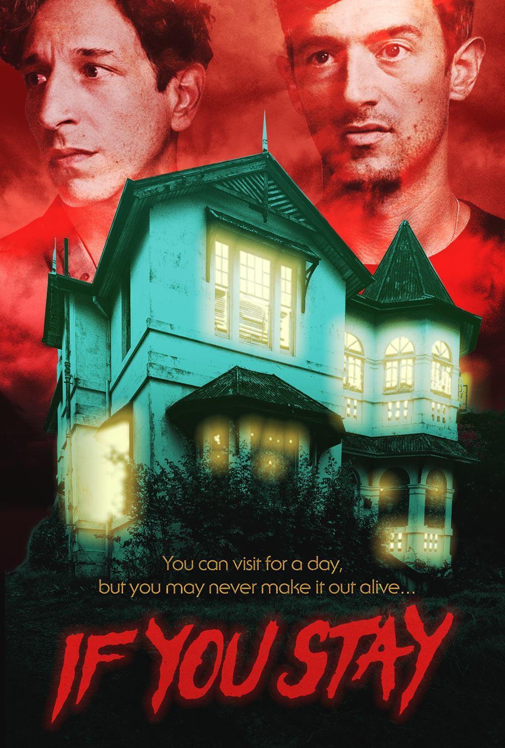
The new website we “designed” for them is a parody of the Netflix website. Information on the site is organized in rows of movie posters. One row contains tour dates, each represented by a movie or TV show with the name of a city in its title that matches the location of that evening’s show (e.g. Manhattan or Hot In Cleveland); there are a few rows of movies curated by Tanlines, each of which simply links to the Netflix page on which it can be streamed; and the top row comprises the songs from the album, each of which is given its own dramatic movie poster we created especially for the site using outtakes from the cover shoot.
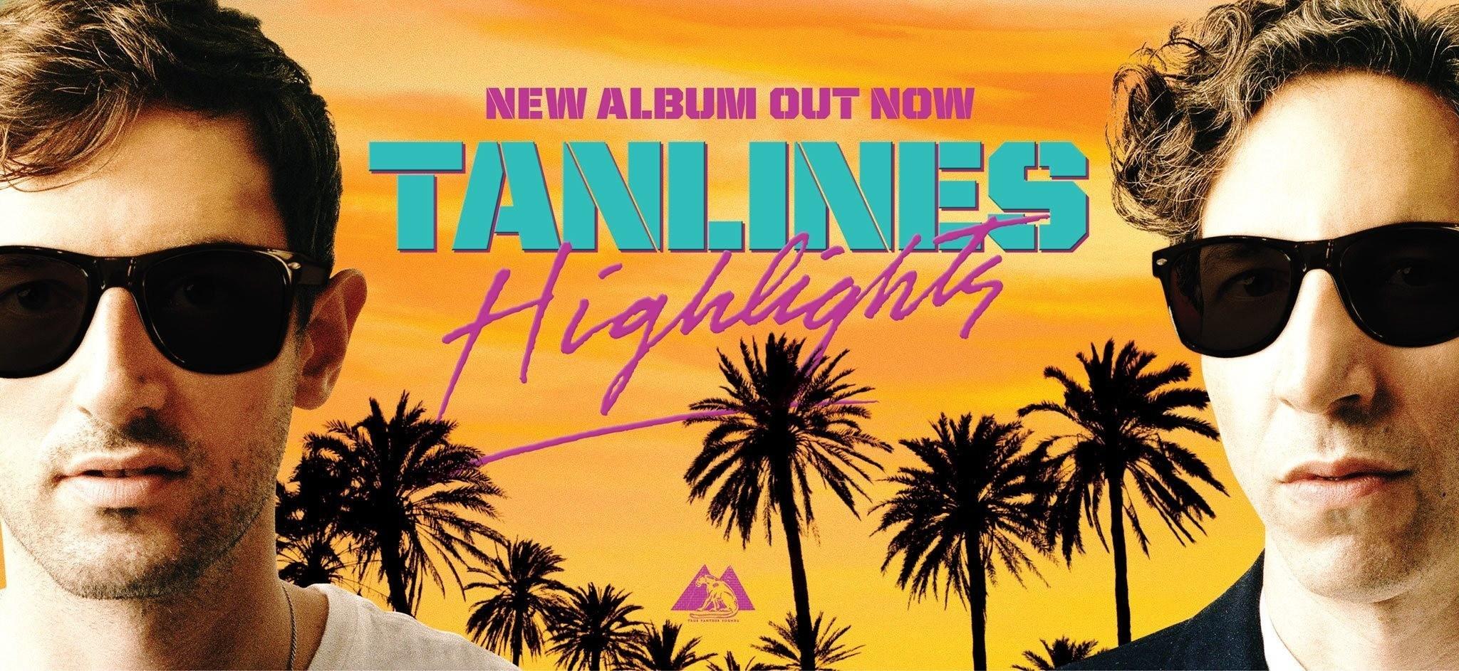
We had such a fun time making these posters that when we were asked to design two billboards for the album, we couldn’t help but turn Jesse and Eric into action heroes starring in their own summer blockbuster.
-
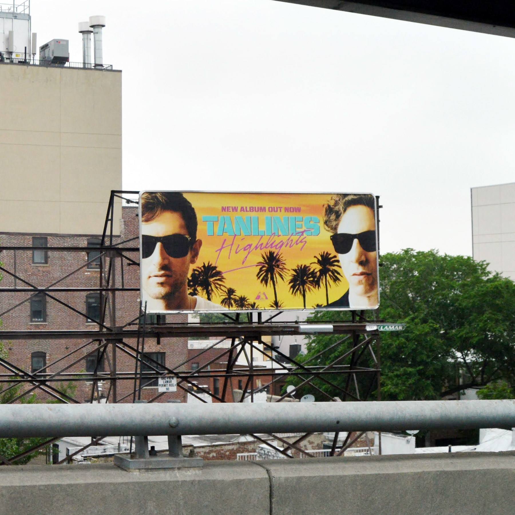
Billboard viewed from the Williamsburg Bridge in Brooklyn.
-
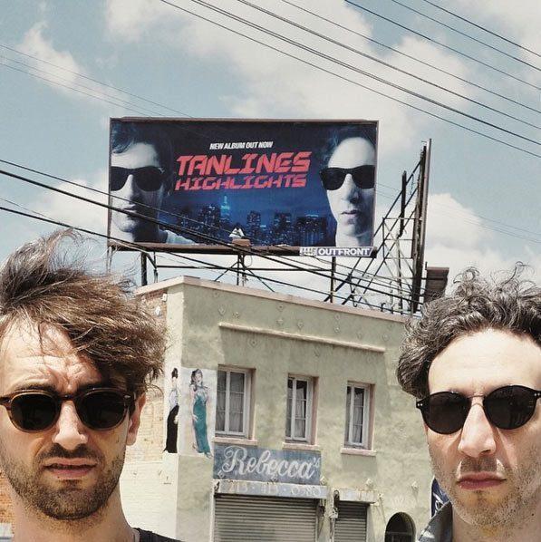
Jesse and Eric posing in front of their Los Angeles billboard.
