Columbia Department of Systems Biology
We designed an identity and website for the newly formed Columbia University Department of Systems Biology, bringing together four distinct initiatives and research centers, each of which previously had its own website and identity, under one umbrella.
-

Logos for Columbia Systems Biology and affiliated research centers.
-
Logo animation
On the website, a large, rotating hero area divides the department into its three chief areas of focus: Research, Education, and Infrastructure; and displays a brief overview of each, as well as links that provide users with jumping off point into some of the site’s most important content.
Several of the latest department news items take up a large amount of real estate below the homepage’s fold, populating in an engaging and tightly spaced grid. The News section itself reads like a succession of feature stories with big images and lots of white space.
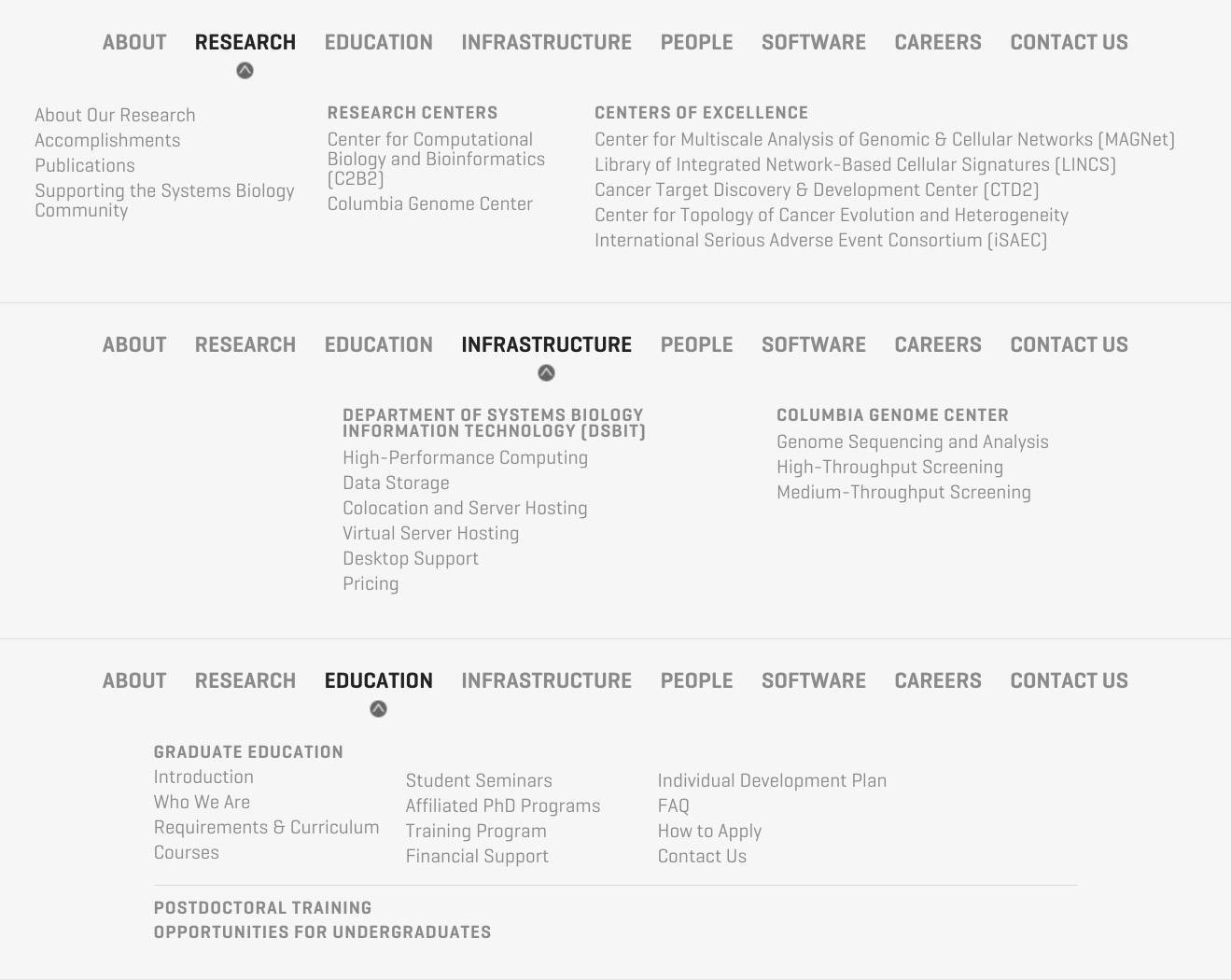
Carefully organized drop-down navigation helps users make sense of the vast landscape of interconnected pages.
-

Top-level and sub-navigation
On individual content pages, devices such as large pull-quotes and inline images help break up the reading experience and lend an editorial quality to the sometimes dense academic text.
-

Pullquote
-

Inline image
People in the Department are organized by type (faculty, leadership, student, etc.) and displayed in a grid, with each entry designed to resemble a business card. Each person’s “card” clicks through to a mini-site with more detailed information. Permissions are set up so that members of the Department will be able to log in and edit the content and pages in their own mini-site.
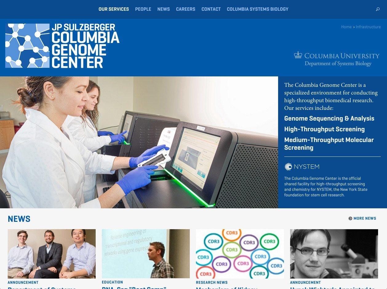
The Columbia Genome Center, while technically part of the new Department, needed to retain its autonomy, so it got its own homepage, navigation, and color scheme. The remaining research centers and initiatives that were brought together to form the Department all get their own homepages and secondary navigation too, but unlike the Genome Center, they remain under the banner of the overall site.
-

Columbia Systems Biology homepage
-

Graduate education homepage