-
The new Art21 logotype
For almost two decades, Art21 has been known primarily for its Peabody Award-winning PBS television series Art in the Twenty-First Century. But the organization is much more than one show.
It produces short-form documentary series such as New York Close Up and Extended Play. It provides educational resources and professional development programs. It even publishes a bi-monthly online magazine. With its thoughtful approach and prolific output, Art21 is perhaps the foremost chronicler of contemporary art.
-
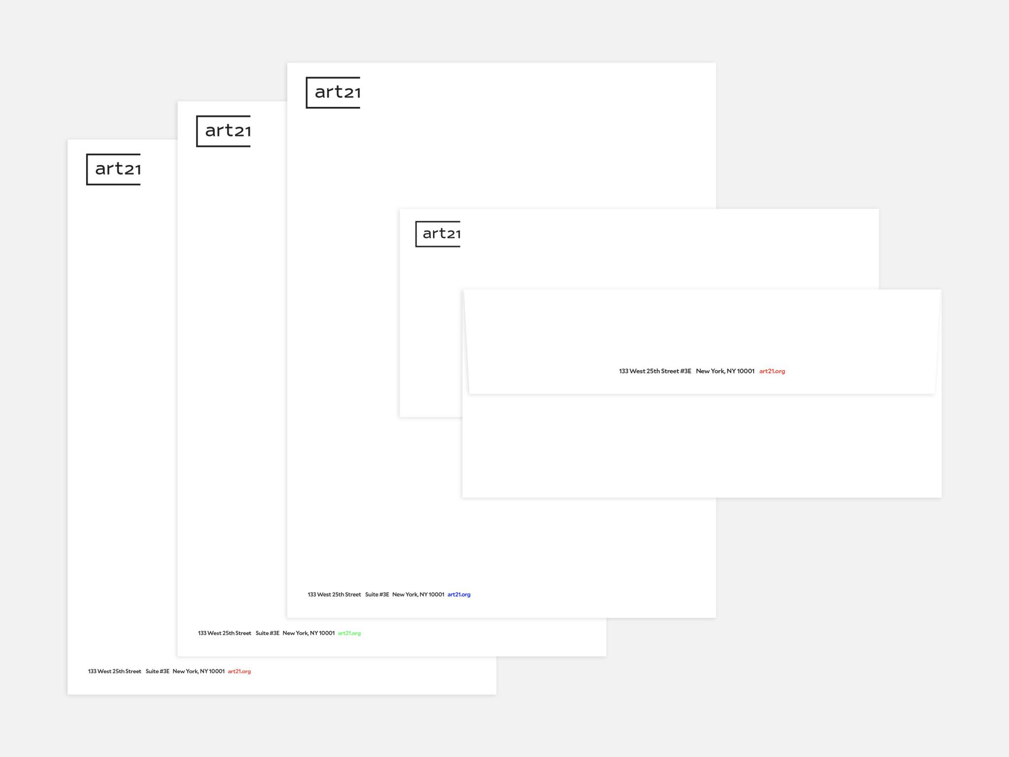
Stationery
We were originally approached to revitalize art21.org to more accurately convey the full scope of Art21’s output. It was through this process we discovered the organization was also starting to rethink its visual identity.
-
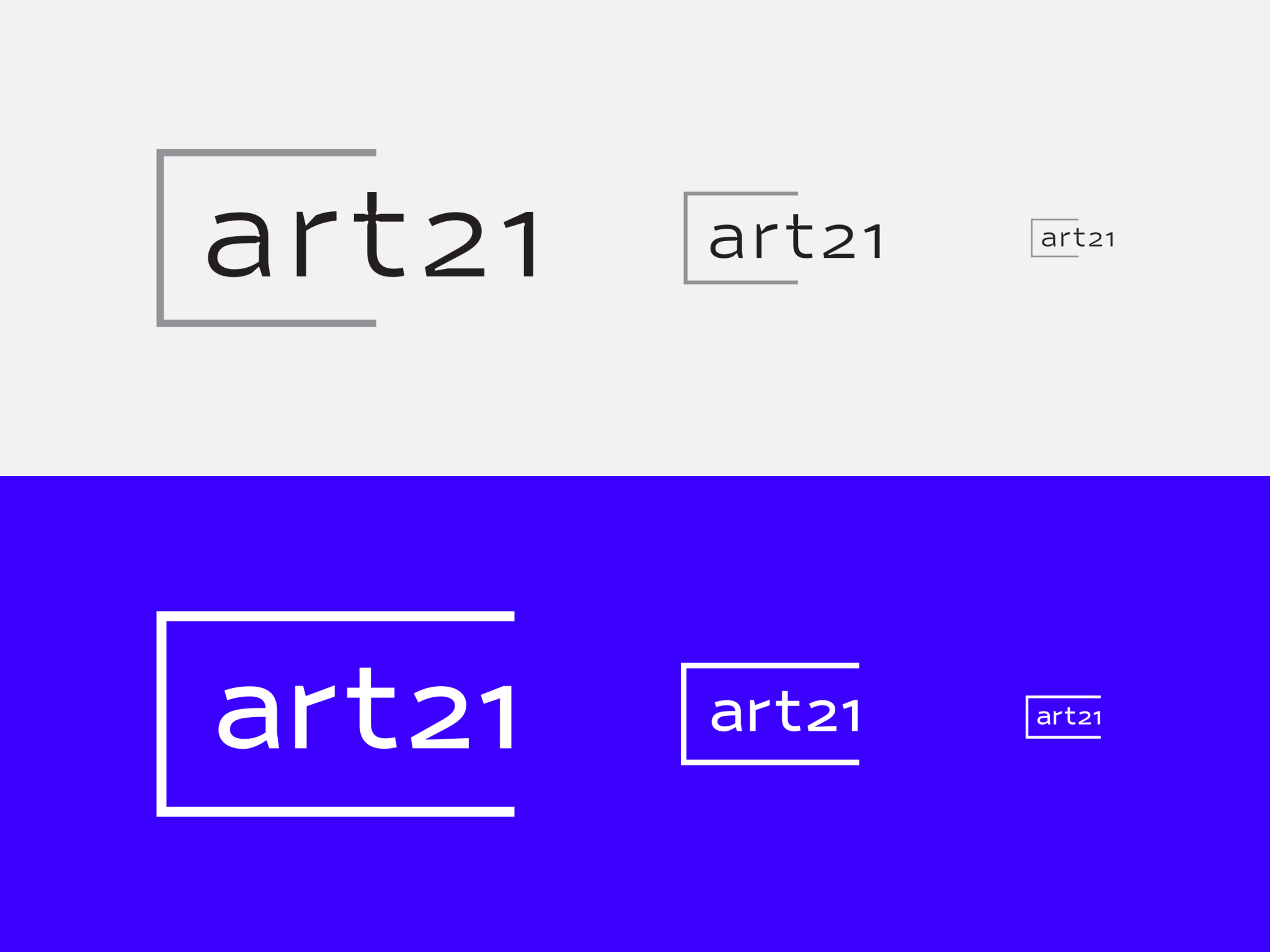
The old Art21 logo and the new one, with its optical sizes
-
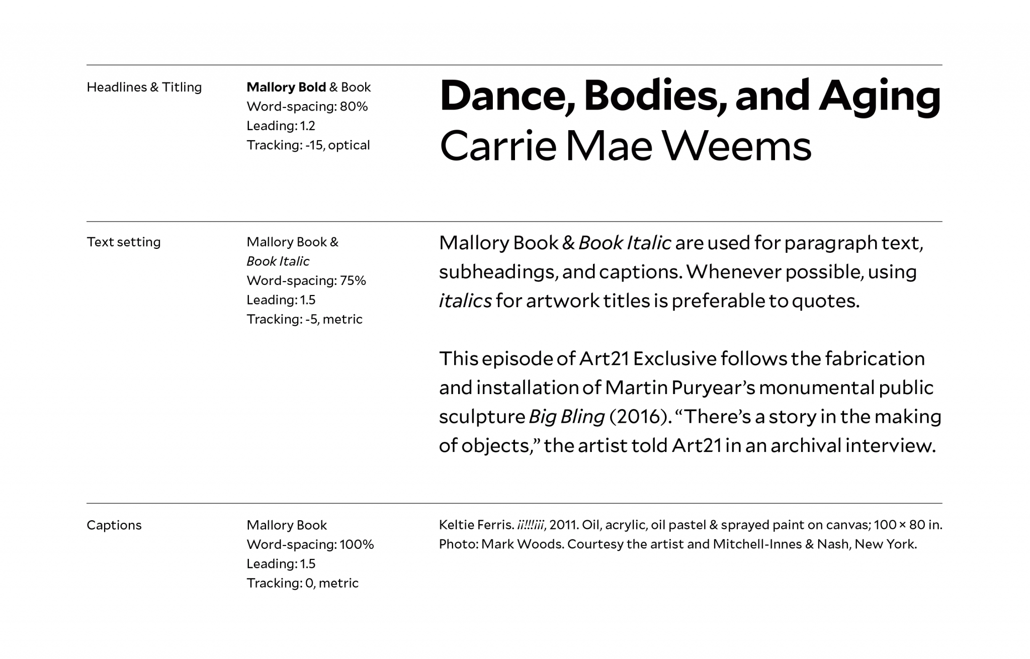
Mallory, the typeface of the identity
With more artist interviews and long-form writing going up online each day, Art21 needed a new typographic system. We replaced its former typeface, Retina, with a new one by the same designer, Tobias Frere-Jones: Mallory. It looks especially great on screens, a must for an organization like Art21.
-

Color palette
We reined in the use of color. Black and white are the foundation for the new Art21 brand. Our spin on the classic combination shown in television test patterns make up the secondary and tertiary colors.
-
Art21.org homepage and video player
Video is the site’s primary focus. We knew it should be clearly presented and widely discoverable. We wanted to provide a great viewing experience and let video become an inviting doorway to the rest of the site.
-
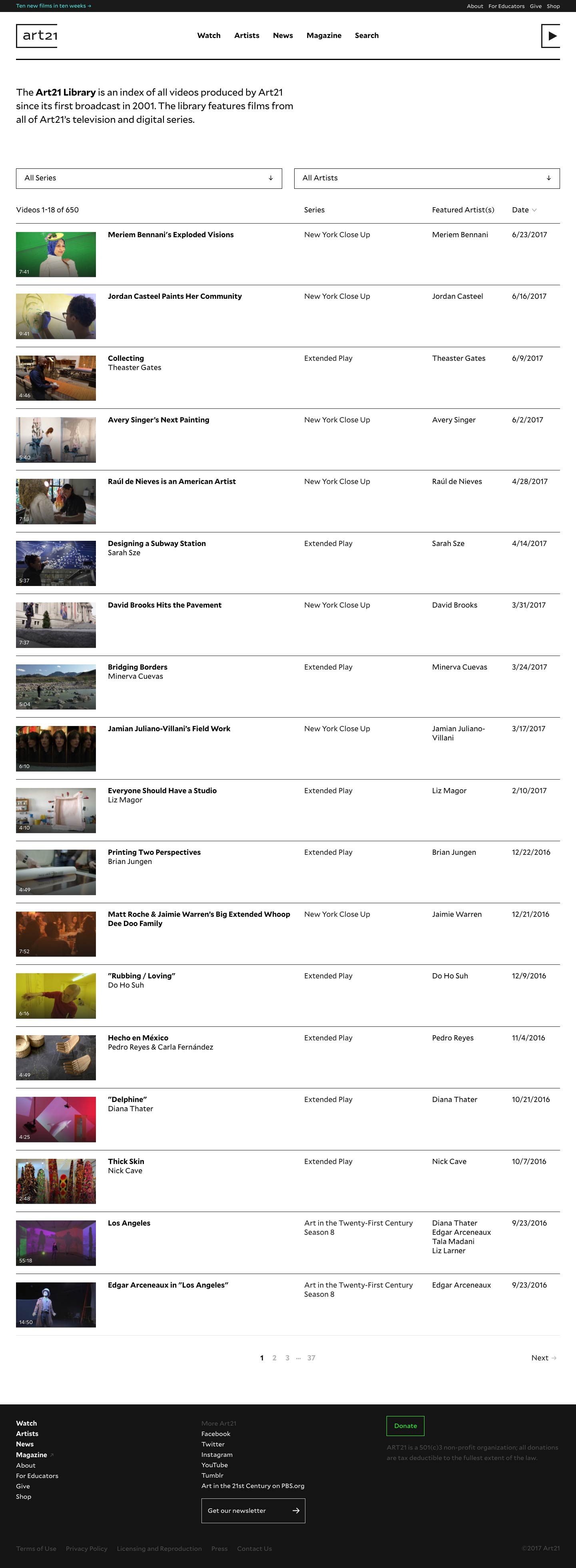
Video library
-
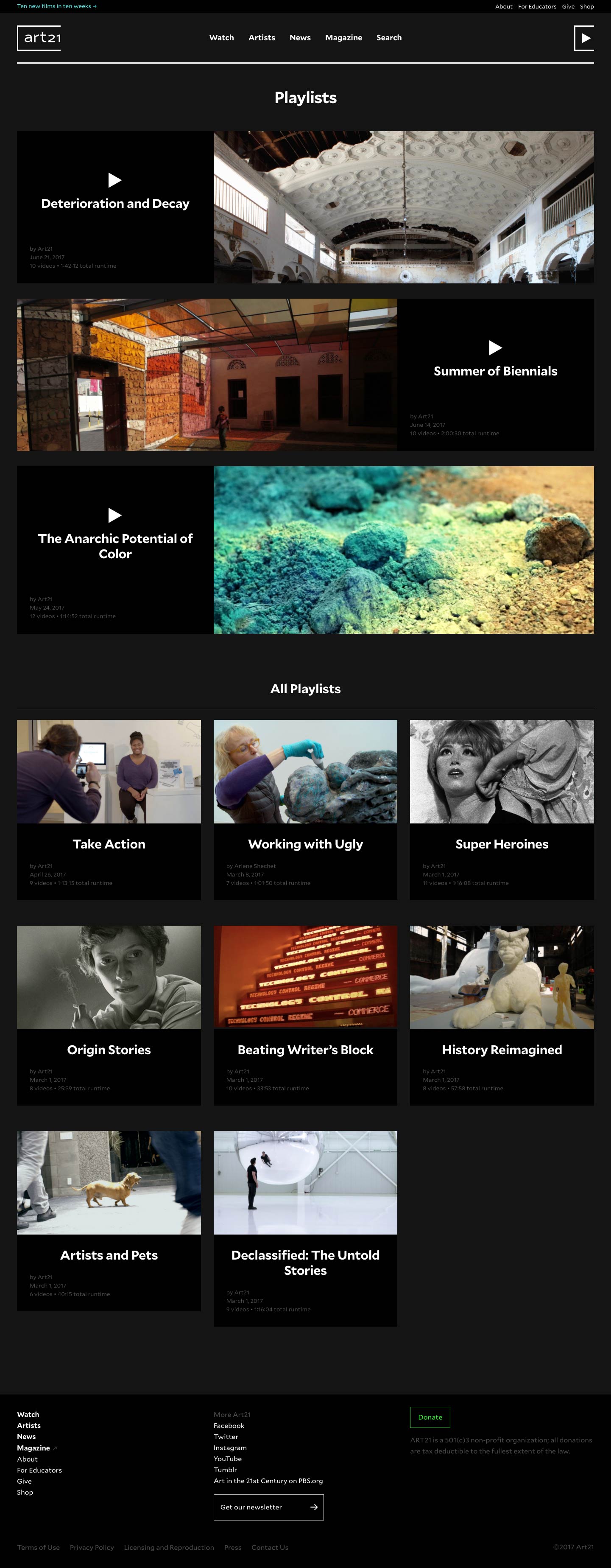
Playlists
Options for finding videos to watch include curated staff playlists and a sortable library containing every video on the site. Or, users can browse by artist. The breadth of Art21’s coverage is such that there can be multiple short films, interview transcripts, photo galleries and news items about a single artist. Users can now access all of that content in one place.
-
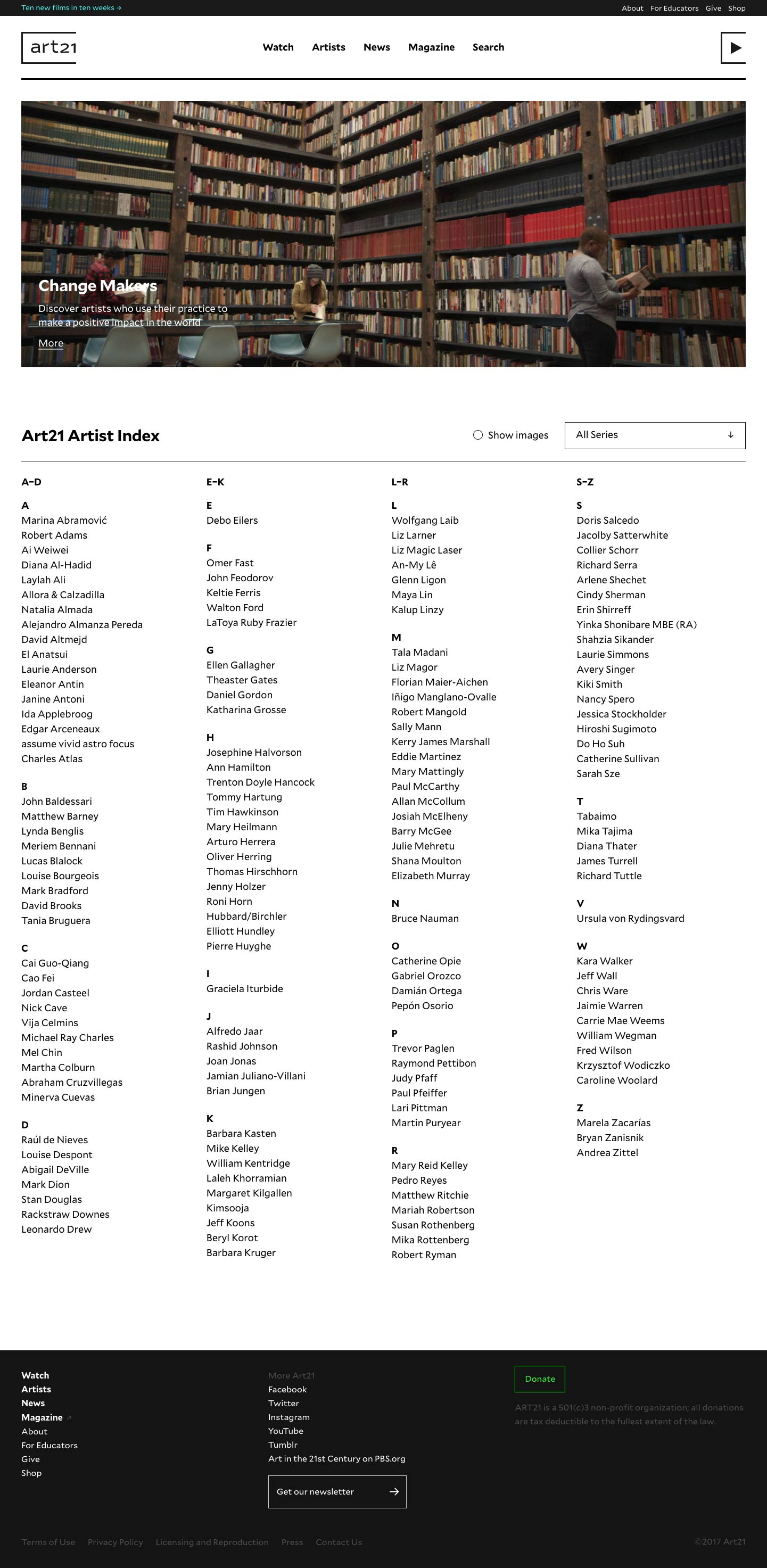
Aritst directory
-

Artist page
-

Artist essay/interview
The new identity affects not just how the videos are presented, but how design elements operate within the videos themselves. In motion, the bracket around the logo can be animated and extended into an underline.
-
Opening title for the series Extended Play
And of course, no rebranding effort would be complete without swag.
-
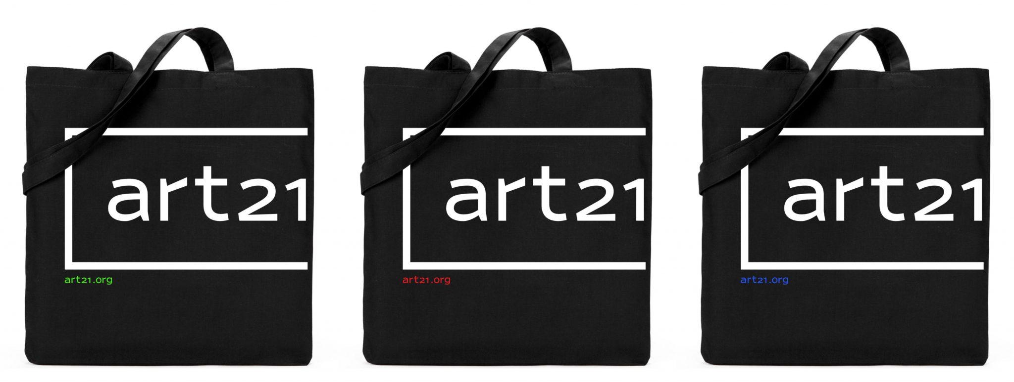
Totes
-
Stickers