-
Main title
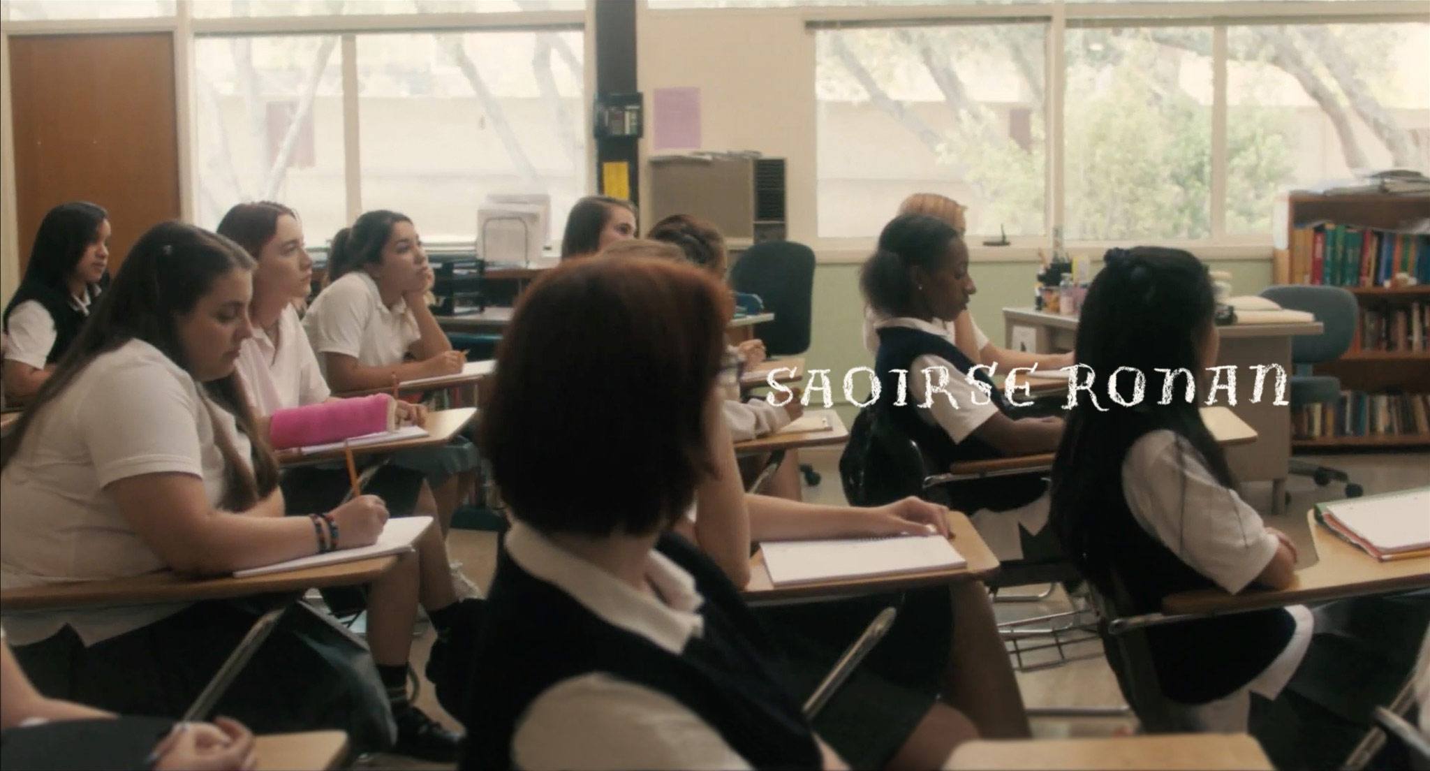
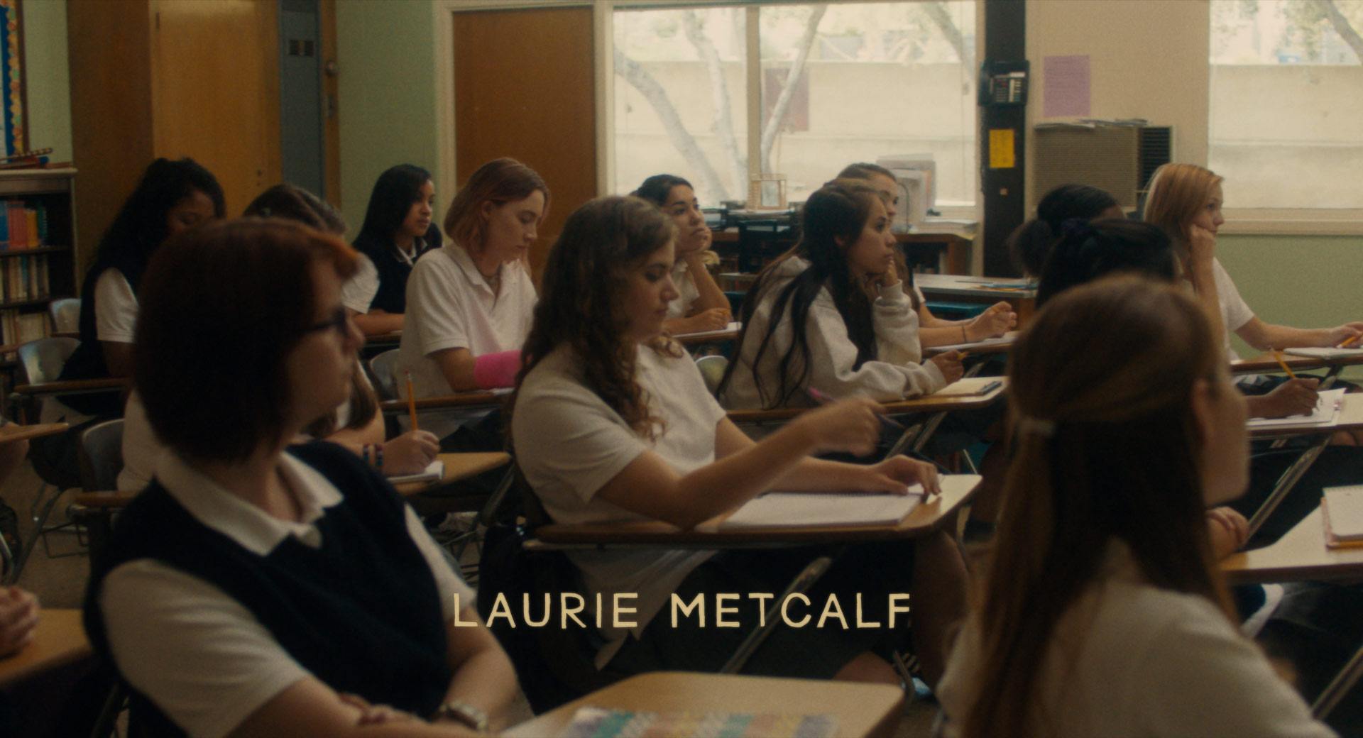
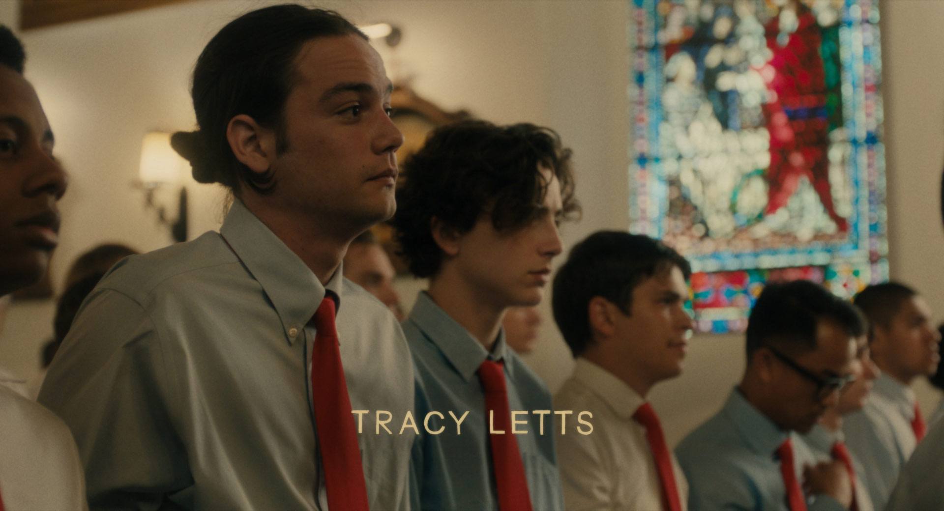
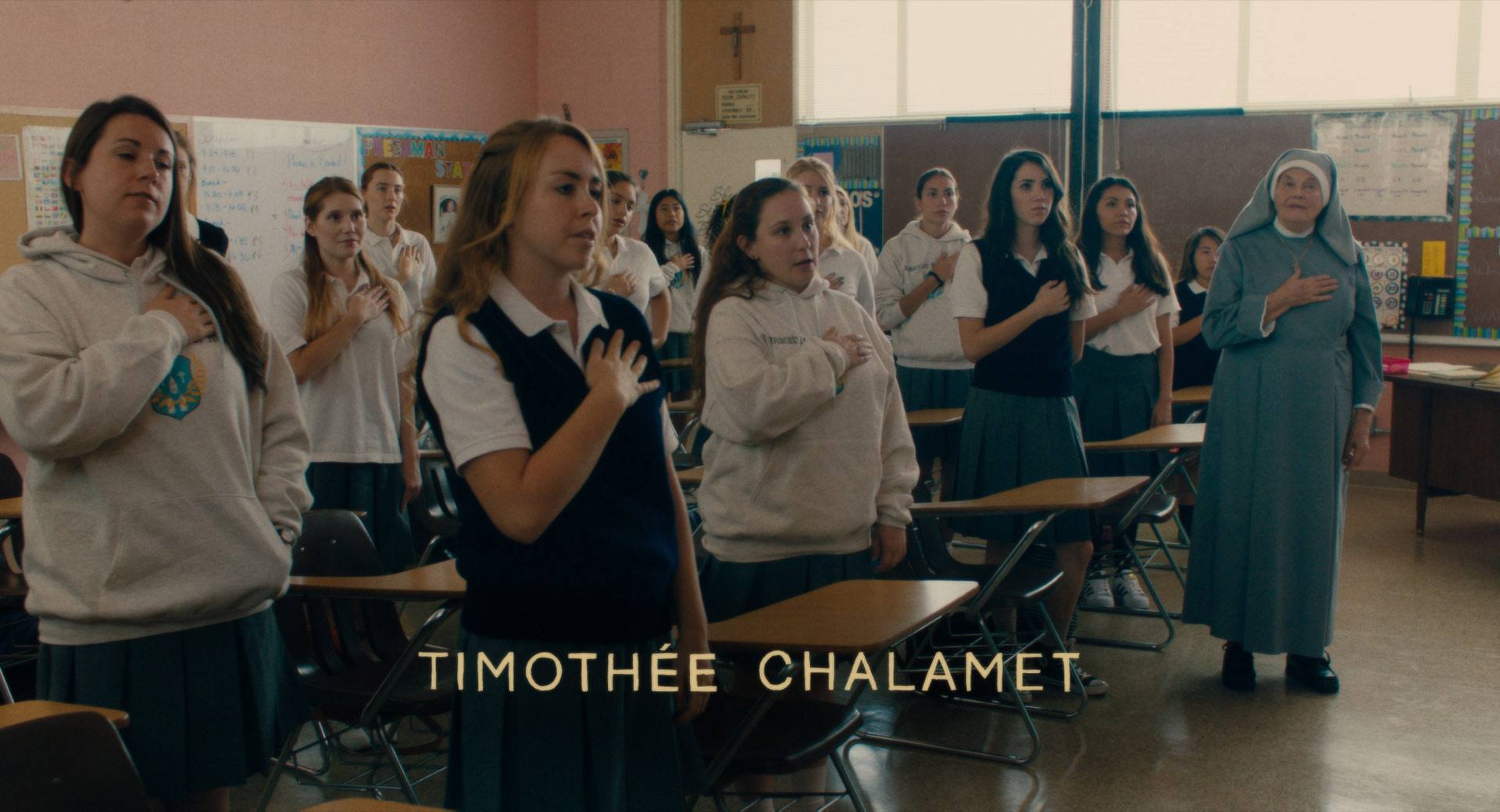
Starring Saoirse Ronan, Laurie Metcalf, Tracy Letts, Timothée Chalamet, Beanie Feldstein
A24, 2017
-
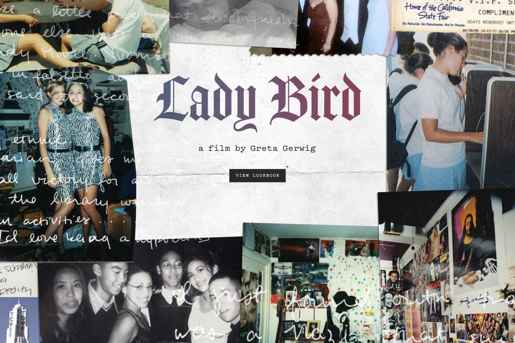
Lady Bird lookbook
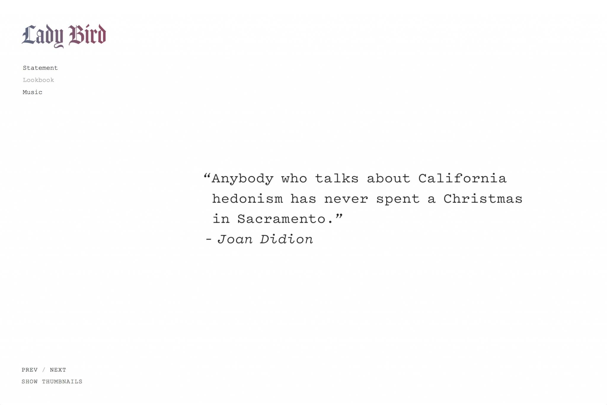
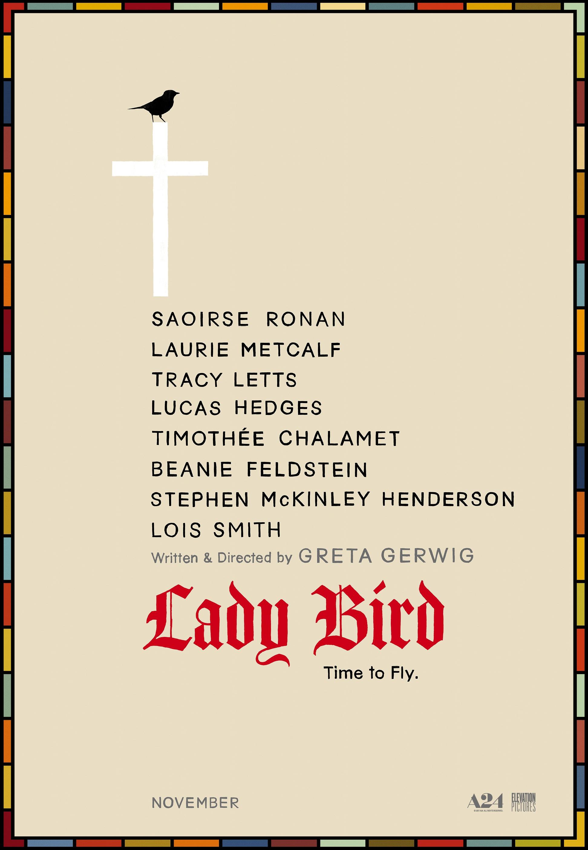
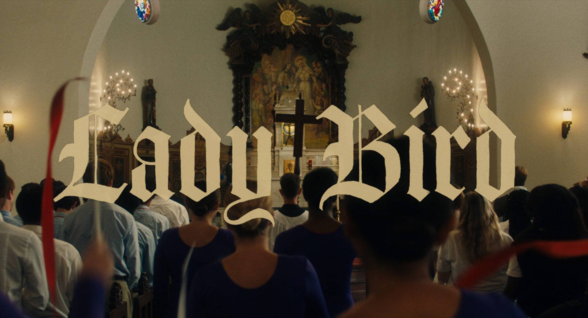
In 2015, Greta Gerwig approached us to help her make an online pitch deck for her original screenplay Lady Bird, which she planned to direct. The movie takes place at a Catholic high school, so we playfully set the title in a condensed Blackletter typeface. (It felt vaguely biblical.)
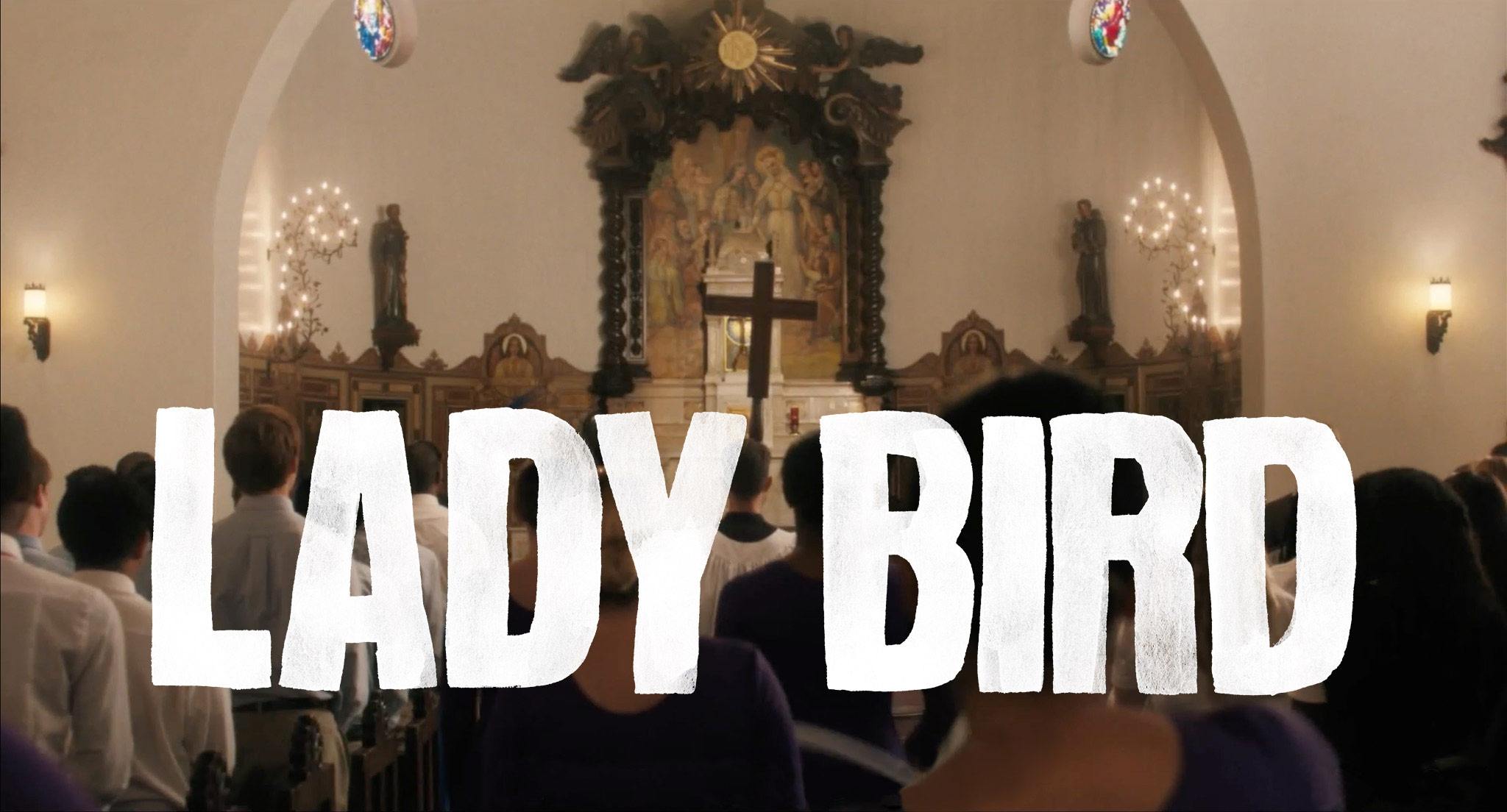
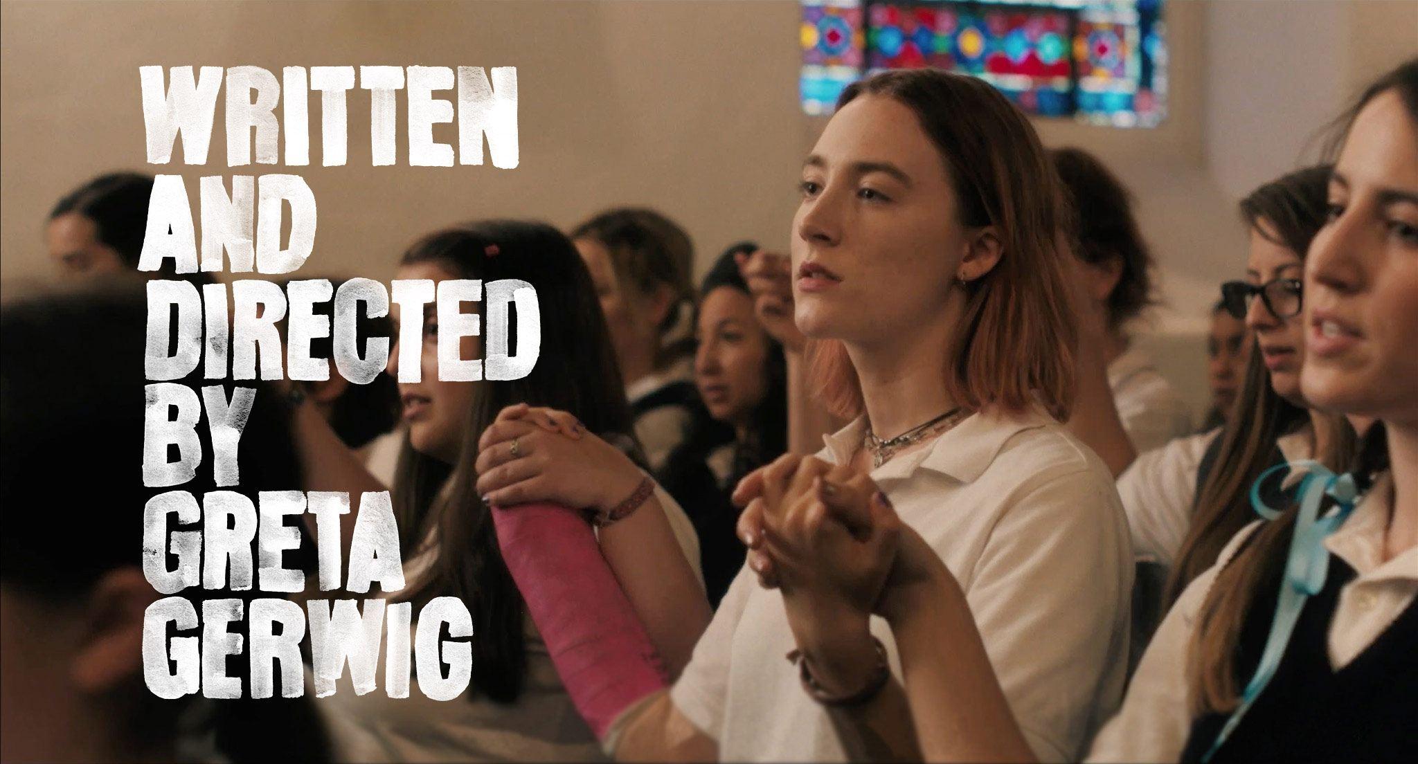
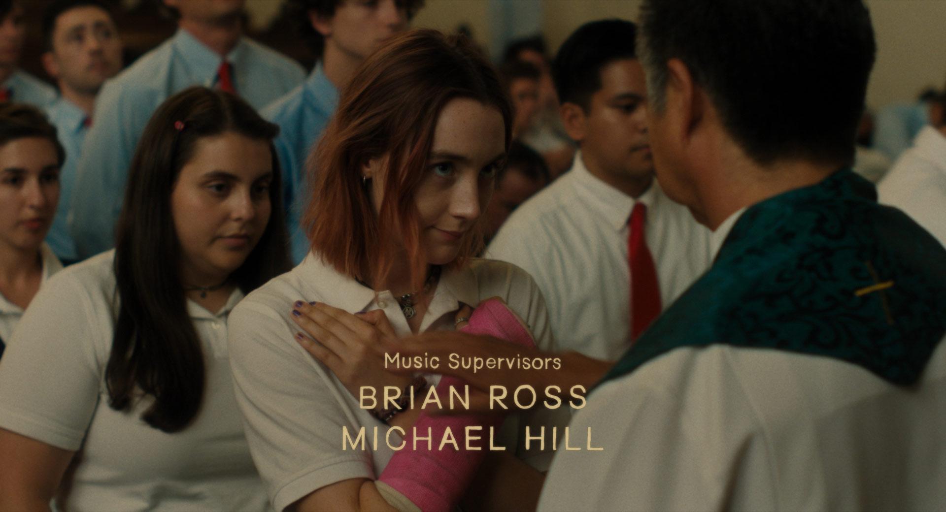
Two years later, when it came time to design the opening titles, Greta wanted something with a slightly handmade quality. Something clean and simple, but rough around the edges. We teamed up with author and artist Leanne Shapton, who had previously done the hand painted titles for Noah Baumbach’s The Squid and the Whale.
-
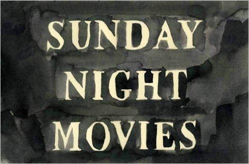
The work of Leanne Shapton
-
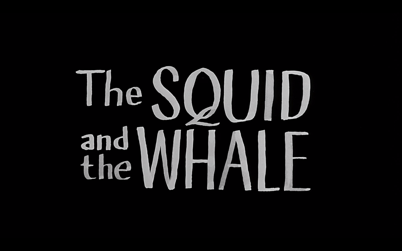
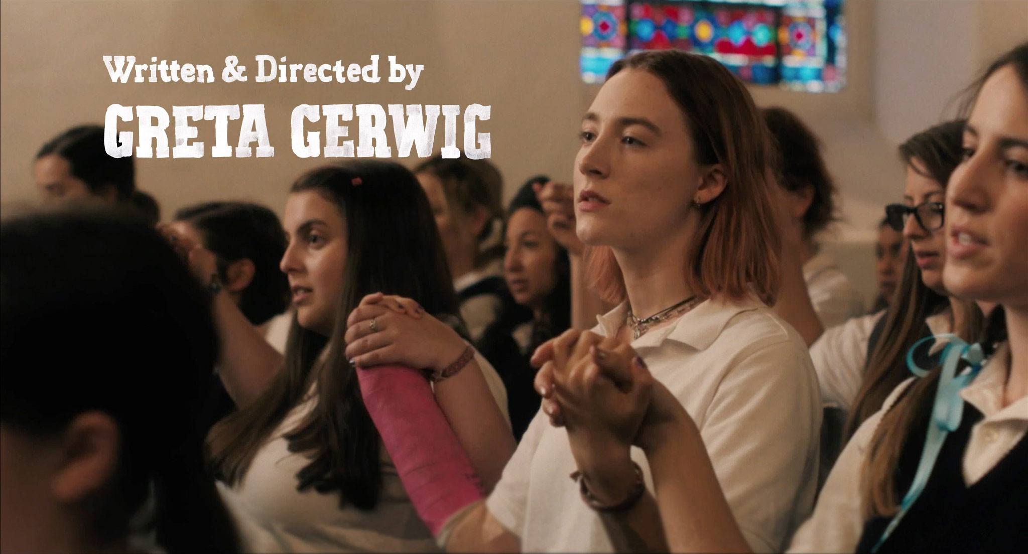
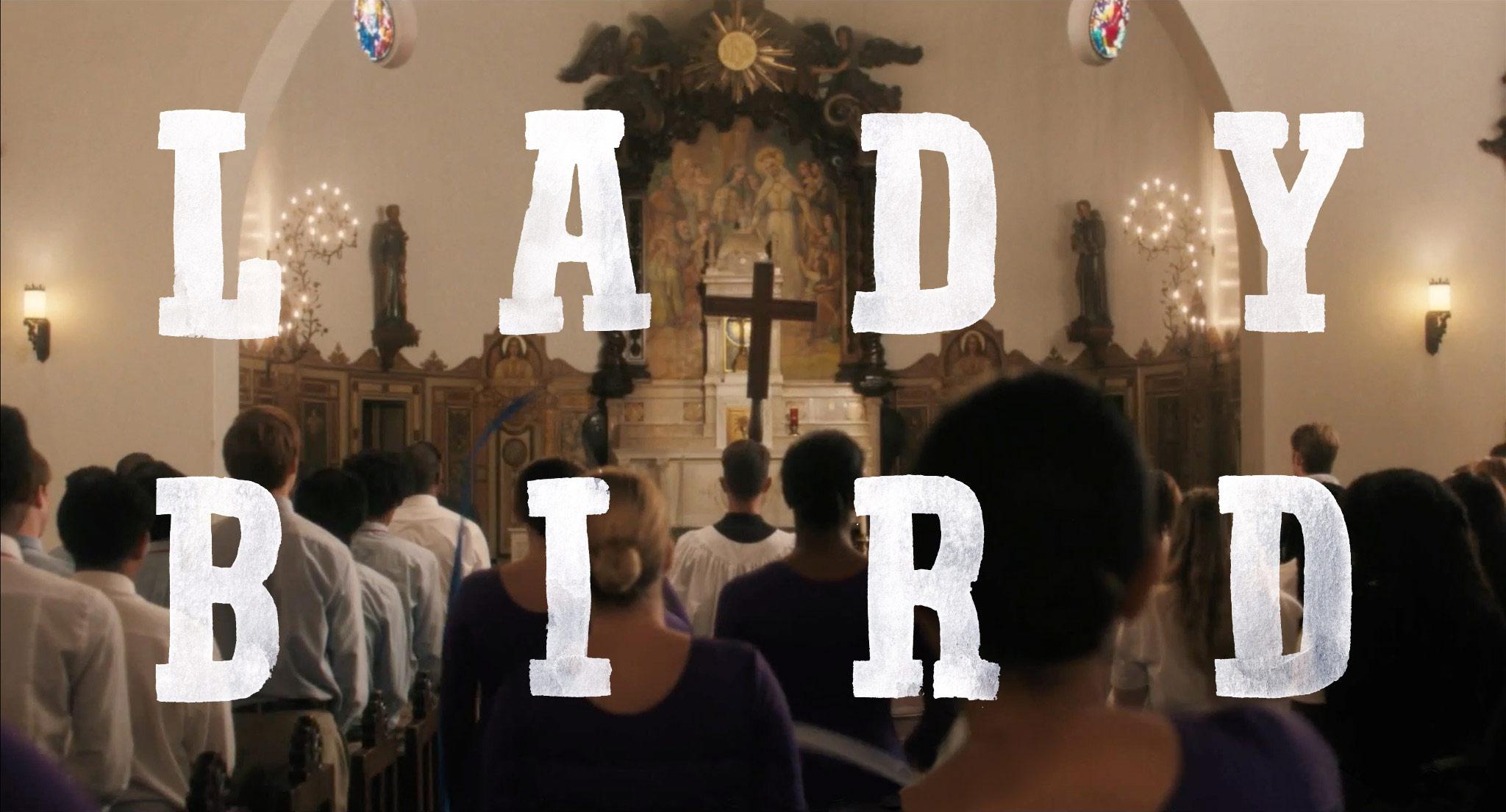
Our plan was to work together to choose typefaces and lay out the titles on the computer. Then, Leanne would go off and make hand-drawn versions, which she would scan and send to us to position on the screen.
-
-
-
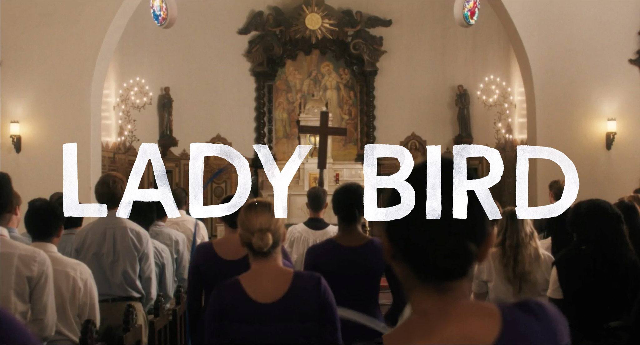
Rejected ideas
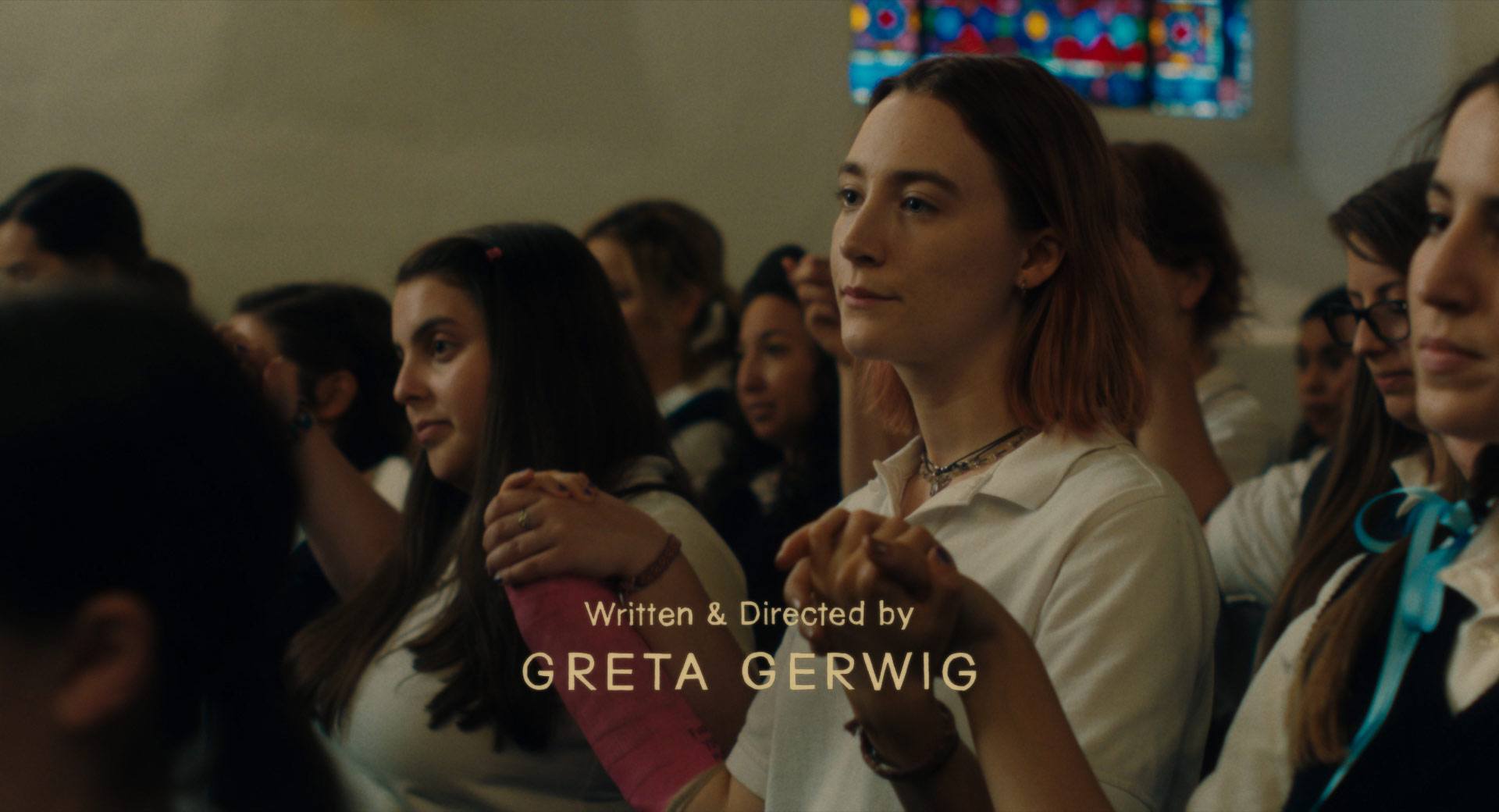
We came up with a bunch of fun ideas, but ultimately the original Blackletter logo won out. Leanne made a beautiful hand-painted version of the title treatment, and we paired it with a simple sans serif with ultra-loose letter spacing. (Each of the main titles was individually hand-painted by Leanne as well.)
-
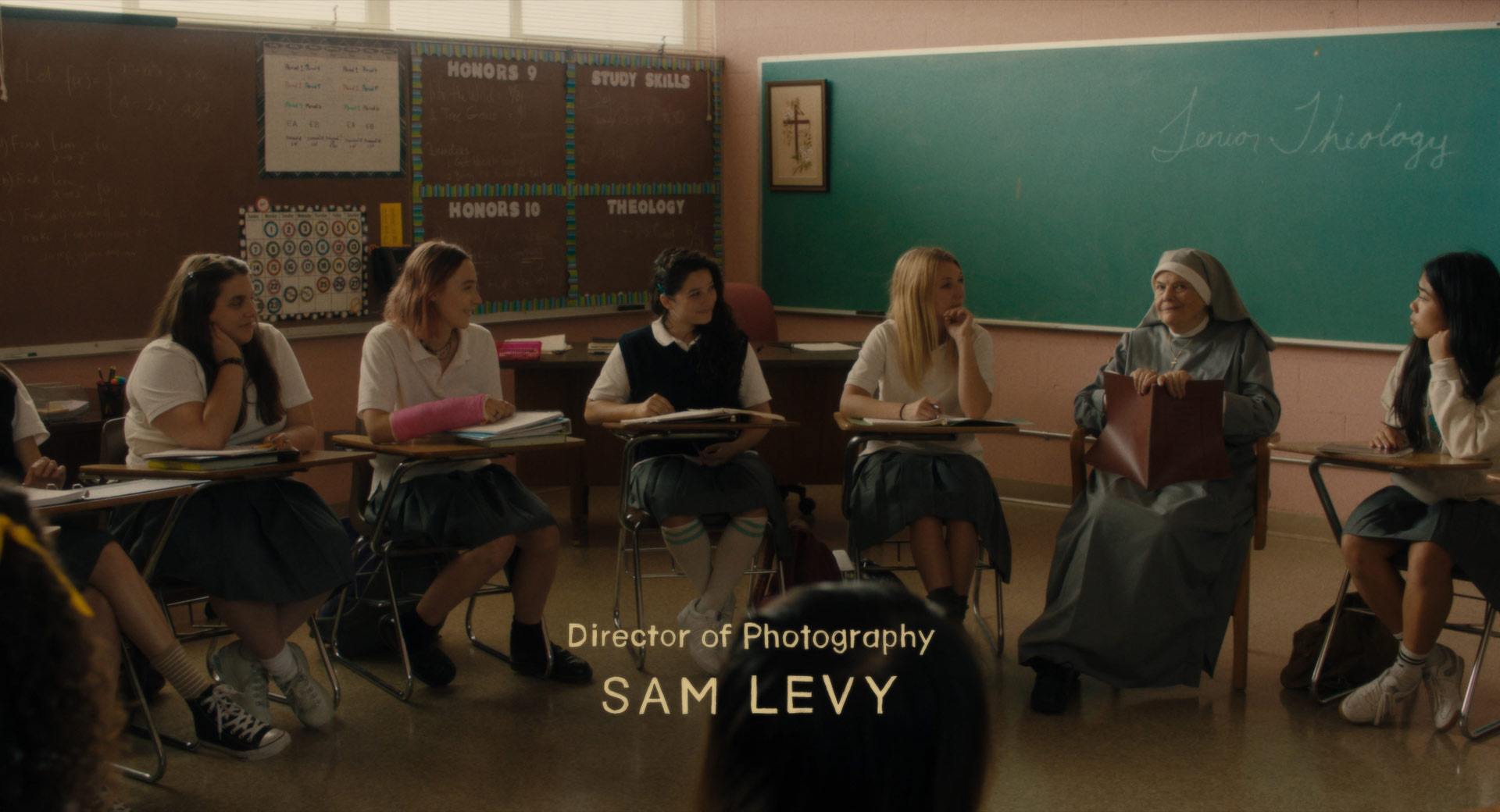
Final opening titles
-
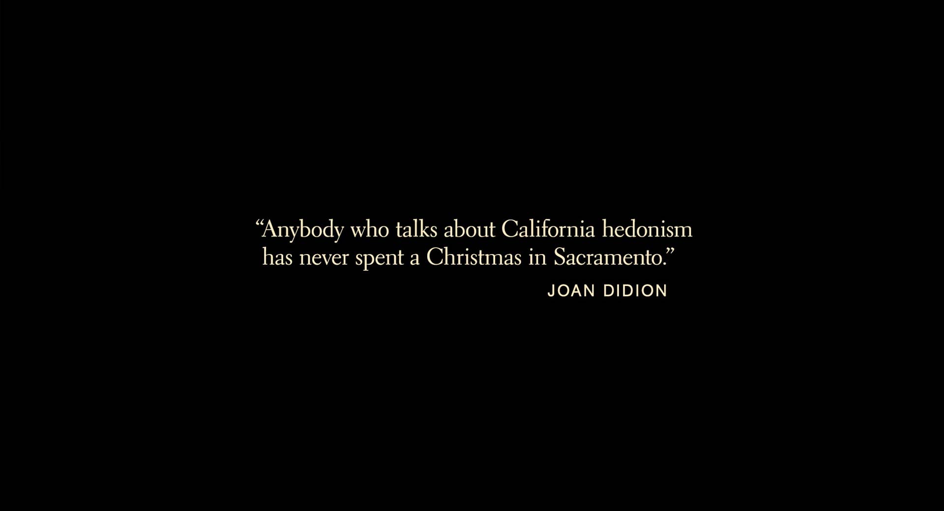
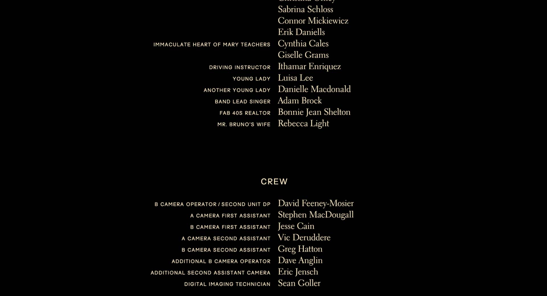
The Joan Didion quote at the beginning of the film, as well as the end crawl, were set in Electra, a bookish serif typeface.
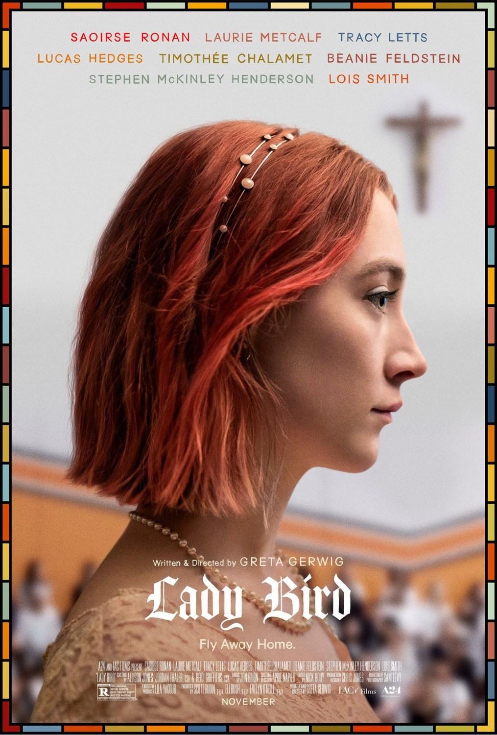
A24 decided to employ the type created for the film in all of its marketing materials, which were designed by BLT Communications.
-
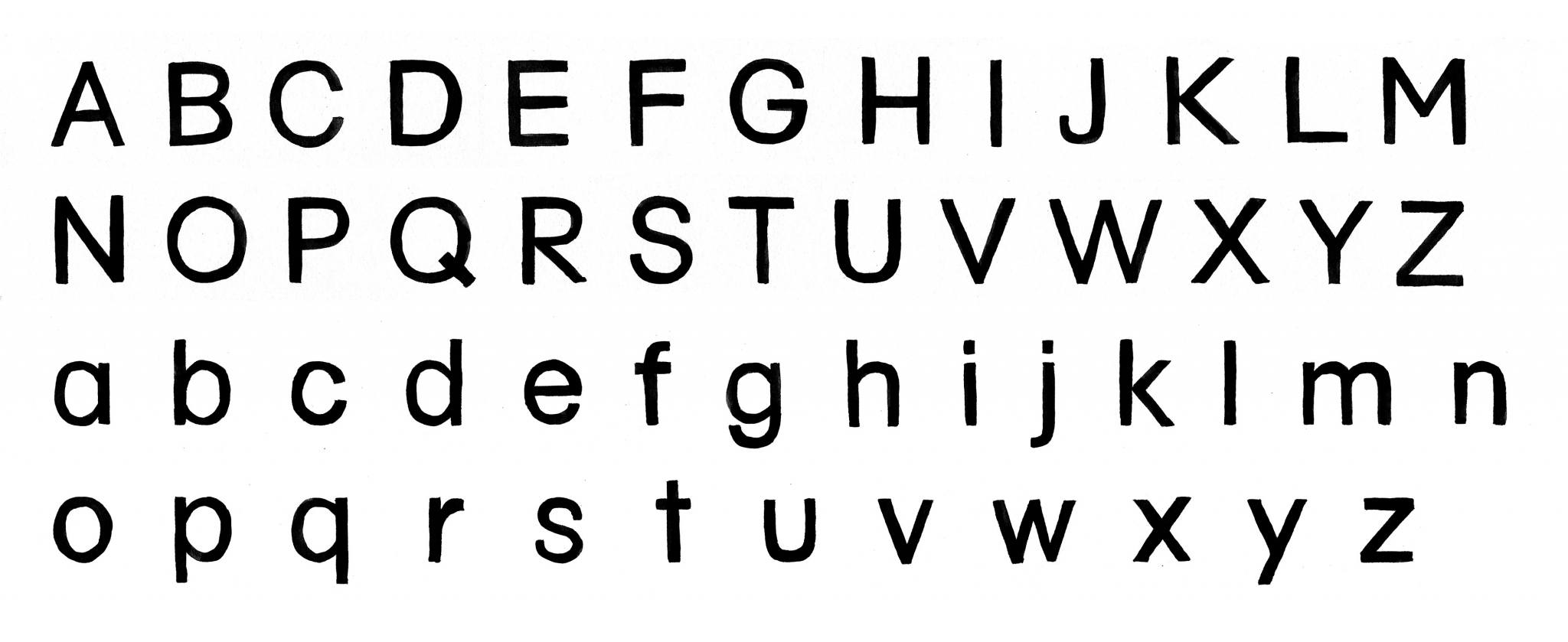
Full alphabet provided to A24, hand-drawn by Leanne Shapton
